Tuesday, May 3, 2011

Spaghetti Face

My father-in-law is a skilled and enthusiastic photographer. Naturally, my father-in-law wanted in on this photo recreation project and I was more than happy for the help! We looked through an assortment of photos of me as a child.  As soon as we came across the spaghetti face picture, he said “that one.” My wife excitedly seconded the motion. Through the help of my wife and her parents, we were able to capture quite a few details of the original photo, especially the more prominent ones.
It was a fun project! How often do adults get to eat like 2-year-olds? I enjoyed it this messy revisit of my childhood.


P.S. My wife was a good sport when I went and kissed her after the photo was taken, thus smearing the spaghetti sauce all over her as well. I figured she might want in on some more of the fun!

-Mark H.

Thursday, April 28, 2011

Zack Fielding


Artist’s Statement


          I chose to recreate an old tee-ball photo that my mom dug up and emailed to me.  I was discussing the project with my mom and we talked about a number of different photos we have of when I was younger.  I decided that the comb-over was definitely a requirement for the project since that was one physical characteristic that described my younger years.
          In order to recreate this photo I obviously had to shave my beard and sideburns.  I then found a shirt that matched the picture and a tee-ball bat.  I then combed my hair over and told my girlfriend to “make my hair look like this”.  My hair in the photo was messy and standing up in the back, so I tried to recreate that look.  It did not come out very clear in the picture because my girlfriend is short and I am much taller than I was, so the camera angle isn’t exactly the same.  I tried to match up the grip of my hands on the bat as well.  One of the interesting parts to recreate was the smirk and look on my face in the original picture.  I don’t know what I was thinking in that picture twenty years ago and without knowing that it was hard to replicate the smirk.  This project was a lot of fun to do, and received laughs from friends and family when I shared it with them.


Wednesday, April 27, 2011

Hmmm...


Artist Statement: Photo Project
                For my photo project I chose to go with an iconic style as well as artist. Andy Warhol has always been a bit of a fascination of mine. From his use of colors, to his unique choice of imagery he has long since made an impression on me. This is why Andy Warhol was the obvious choice. That and the fact that he is one of the only artists that I most accurately resemble, or at least can resemble with some minor tweaks, also helps his cause.
                I choose Andy Warhol’s self portrait ’67 carefully among the many choices that Andy Warhol created because of it’s sense of style. For one, Andy uses his hands to convey that he is pondering, maybe his next piece or maybe even what his next move is in his daily routine, either way it is a strong masculine pose where the face is framed with shadows. Also, color is used to make the most genuine aspects of a masculine face stand out, such as his jaw line and facial structure. Lastly, I am intrigued that only half of his face is shown, maybe signifying the dual nature within the artist at the time of creation.
                In recreating the photograph I knew right away that I would have to seek the aid of computer photo editing software in order to capture the pop art feel. For this I used Adobe Photoshop, which proved to be effective. I had to try to mimic Andy’s pose for many shots that I was then able to play around with inside the program. I started by creating a gradient within the image to show the light and dark side of the photo. I then used one of the filters to create more of a cut out feel and then added the yellow streaks to my hair and basically colored the photo as if it were a coloring book. All in all I think I my work to the best of my ability given the fact that we definitely have out dissimilarities.
                I enjoyed creating this project for it helped deepen my understanding of how to create art. I was able to use a program that I was unfamiliar with (Photoshop) to have an end product that I am proud of.

Living Life


Shuffling through all my childhood photos evoked a mixture of emotions. I found ten photos that I could possibly recreate. Some I based on the background of the photo, knowing I could recreate the correct background since they were taken in my house in Arizona. On the other hand, there were the photos in which the background was going to be a challenge to recreate. I chose such a photo. I decided it was more about me than about the background. I was about three years old, living in California. My days usually consisted of playing with friends or siblings, often getting into trouble. This photo however, captured a brief moment where I was playing alone. I had a Barbie in one hand, a necklace on, and heart sunglasses upside down. I love my innocent, happy smile in this photo. It truly shows my happy childhood. 

Stacey McCraw


Artist Statement: Stacey McCraw
I chose a painting by Raphael that had been assumed to be a copy by
another painter. Last year, it was found by a museum worker doing
inventory and he started to think it was perhaps an original by
Raphael. The article I found on Today claims that art historians will
still have a lot of work to do to make sure that it definitely was
painted by Raphael. I have not been able to find the latest news
unfortunately.
When the project was first presented I looked back at all of my
childhood pictures. Unfortunately my mother made the terrible mistake
of insisting I have ridiculously ugly bangs for my entire childhood.
So I decided to look at painted portraits from the Renaissance because
I have always loved those. I narrowed it down to this portrait and The
Girl with the Pearl Earring. But I thought that I resembled this
painting much more.
In order to recreate the image, I went to a fabric store with the
image and found fabrics that seemed similar to the image. That was
fairly simple but the hard part was figuring out how to do my hair
like her. She must have had a lot longer hair than I do. I ended up
putting my hair in two braids and passing them over at the top. It was
very difficult to hide the pins and hair ties. It was also very
difficult to make the veil look like hers and I didn’t quite achieve
that. The lighting in the portrait is very extreme. It is in a dark
place with a spotlight. In order to achieve this I stood in a corner
of my room with the lights off and then shined one light on myself. My
friend shot the picture for me because he is very good with cameras.
Overall I am very pleased with the photograph although I can
definitely find many differences between it and the portrait. I really
enjoyed this project because I not only tried to replicate how she
looks but I tried to replicate how she did her hair and her facial
expression. This made me think about what kind of person she was.


Brittney Dicker's Artist Statement:

For this assignment I decided to replicate a photograph by Edward Steichen. He was known for photographing celebrities as one of his top specialties. The photograph I selected was of Gloria Swanson behind a veil. It was taken in 1924 during her prime years. The dramatic feel of the photograph instantly captured my attention. Swanson was a well-known star in the 1920s. This photograph was also one of the most celebrated portraits that Steichen has taken.
My version of the photograph was taken of my younger sister Jordan who is 16 years old. I always ask her to model for my photographs because she is so comfortable in front of the camera and looks amazing in all of them. Jordan resembles some of the womanly features of Gloria Swanson: her shaped eyebrows, long lashes, and lips. Steichen tends to use sharp focus and props in his photograph, so I made sure that I was able to grab a black lace cloth to match his image. Although the lace is not in the same position as in Steichen’s photograph, I still think I utilized it well to create the same approach. I wanted to grab the viewers’ attention by having Jordan’s eyes be the dominant focus in my photograph. The time of the day is unsure but both images have sparkling eyes that are being reflected by some sort of light. The facial expression is revealing sex appeal and fierceness. The whole purpose in my idea of portraying this image was to attract other peoples’ eyes to my photograph. My sister is basically forming a connection with the audience or whoever is viewing the photograph. I am still capturing the 1920s style but mixed with a little 21st century flow.
This photo project was a great opportunity to express my photography abilities and to incorporate technology and culture from today’s world with styles back in the 20s.


Artist Statement: Stephanie Castillo

I chose Rosie the Riveter to recreate. Although she is a drawn figure, she is representative of a large female group. I thought it would be interesting to recreate because Rosie is a drawn figure. In order to recreate he look as closely as possible I searched for a demin shirt and a red bandana. One of the most difficult part was finding a denim shirt that best matched Rosies. Since Rosie is a drawing the most difficult part was deciding the emotion or facial expression I should have in the picture. After many takes I decide to go with the picture shown I feel it most closely represents Rosie.
Recreating this picture was very interesting because you don't normally think of all the details in a picture until they are missing. Making sure the shirt was matching, the bandana appeared the same not just in color but in shape once it was in place. Position of the arms is everything in this picture, didn't notice some differences untill comparing the photos.
Overall I am satisfied with the result, I believe the picture on its own would still be recognized as Rosie.

Tuesday, April 26, 2011

Portrait of President Nixon


William Collin's Artist Statement

For my photo project I wanted to recreate the portrait of a historical figure. My interest in American history, lead me to the portraits of our presidents. Keeping within the parameters of the assignment and also keeping in mind the limited amount of tools I had at my disposal to recreate one of these portrait would prove to be a very challenging task. I looked at the most obvious details in the choosing of my portrait the lighting, the cloths they were wearing, what setting are they in, and I needed to think about whether I could find a physical match between a president and a person I know. This directed me to the portrait of President Nixon by Norman Rockwell. His portrait is made up of only a few components there is the plain background, the chair he is leaning against and him. Also with further analysis of the portrait I saw a slight, resemblance between my roommate Justin and the president. Though they are far from being an exact match I saw that the general outline of Justin’s face were close enough to that of Nixon’s. All I had to do to create the match was get him to be a good friend, put on his suit and pose in a way that is similar to the portrait. The ultimate challenge that I had was creating the proper light effects to give the portrait justice. I needed to darken my apartment, and also need to lighten up my roommate Justin. By turning off certain lights next to my backdrop and using a flash I feel like I was able to give the portrait justice. In the end I enjoyed the project because of I was able to include my interest in history and I was forced to step outside my comfort zone in order to fulfill the requirements of the project.

Photo Project Section C Heidi


Artist Statement by Rachel Rinella

I chose a photo from when I was 8 years old with my new kitten, Chloe. My aunt’s cat recently had kittens and she promised me one of the females. When I found out there was one female born, I was so excited I immediately started brainstorming names and came up with Chloe before I even saw her. When Chloe was finally allowed to come home with me, she was my best friend. I insisted on doing a photo shoot with Chloe and this is one of the many photographs of me posing with my new kitten. I chose this photo because I thought it would be fun to recreate this image with my same cat 12 years later and see how we changed. The photo was pretty easy to recreate because my location and outfit were simple. I wore a white tank top and jean shorts while holding my cat in the entryway of my house by the front door. Since my cat was no longer a kitten, it was harder to hold her in the same position. The lighting of the original photograph was also hard to recreate because the background was so dark. I really enjoyed doing this project because I was reminded of many fun memories while looking back at all of my photos.

Monday, April 25, 2011


When I signed up for this class, I thought it was just going to be an art history lecture course like I had taken last semester. Not only have I learned about art in this class, but I have been able to experience it hands on and in a way I never had before with this journal. I am not a very artistic person, I have no prior art experience, and I am not at all confident with my abilities to create art. When we were assigned this journal I was honestly dreading it, wondering what I was going to do because my artistic side was not up to the standards I thought everyone else’s would be.
This journal really forced me to find my creative side and embrace it. With a new journal entry every week there were so many different kinds of art that I had to work with. I became a lot more comfortable with my drawing capability as the weeks went on. Also, the stamping project was something completely new for me. I was so nervous to carve into my block for the first time, I really had to plan everything out and be sure that I knew what I was doing because we only got one block to carve on. I also got to play around with some photography in a few of the journals. I have always enjoyed photography and never really thought of it as a form of art.
This journal really helped me learn about myself through art. Each entry was personal to me in one way or another. The weekly assignments had me dig down deep into my own thoughts and old memories to pull together something creative. I learned a lot about myself through this process and I believe that was the point of this journal. It helped me see that everyone, even myself, has some form of artist in them and art can be made out of pretty much anything, anywhere, and by anyone.

Photo Project Section C Heidi


Artist Statement By Mary Spyrka


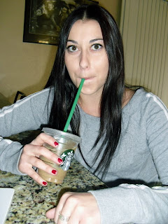
For this specific photo project I choose to recreate a picture from when I was about seven years old. I choose this photo because I knew I could recreate this photo well, and I had the necessary props and clothing to recreate it. I really liked this photograph too because it captures a very candid moment of me just enjoying a Starbucks drink. I also think this picture is kind of humorous, because at age seven, I probably shouldn’t have been drinking a large Starbucks coffee. In order to recreate the photo, I put on a gray sweater; which looks very similar to the one I’m wearing in the original, and got a similar looking Starbucks coffee to drink out of. I had my friend Carly take the picture, and with her help, she was able to put me in a position that was similar to the original photograph. The only problem with the recreated photograph is that the table and the background do not match the original, but I tried my best to make the two photographs look alike. Overall, after looking through dozens of old photographs while I was home, I was very happy to find a simple and easy one that I was able to recreate. I enjoyed this project because the creating process allowed me to look at old photographs and made me reminisce about all my wonderful childhood memories.

Sunday, April 24, 2011


The photo I chose to recreate is a picture of me dressed up as a cowgirl.  I am about 4 years old at my day care center, and we had a pony come to the camp that day so that we could take pictures with it and ride him.  I chose this photo because I remember the day vividly.  I was eager to start taking pictures; I loved being in front of the camera.  I have never been a shy person, and this was an opportunity to have all the attention on me.    
            Although it was somewhat challenging, I was able to recreate the photograph.  I definitely do not have the same style that I had when I was 4.  I have long hair now, and polka dots are not in my wardrobe.  In order to get creative, I used my brownie vest from Girl Scouts in order to have a brown vest like I wore in the picture.  I borrowed my dad’s cowboy hat that probably has not been worn in over a decade, and I had to buy a yellow bandana.  To somewhat recreate the shirt, I layered two shirts to get the two colors that I am wearing, pink and white.  I smiled with the open mouth, and looked to the camera with a squint in my eye.  Another challenge was trying to figure out what to do for the background.  The day care center has since been remodeled, and not too many places have wired fences anymore, especially with a big blue tire in the background.  The hardest part was the fact that I kept laughing when my friend was taking my picture. I was having such a good time; it was hard to get the photo that I needed.  Despite the few obstacles, I did the best that I could with my Tucson surroundings.
             This project was pretty fun.  It was challenging to try to get the exact pose I was in because every picture is a captured moment in time, and to attempt to recreate it brought about a lot of laughs and resulted in many pictures taken.  What amazed me most was the comparison between the two pictures.  I am honestly in awe of how much I have grown up.  Now I understand the meaning of “kids growing up to fast.”  I am glad that I did this project because it helped me reflect on the past, but also made me excited for the changes that the future will bring.    

When we got this project assigned I was really excited about recreating a picture of myself from when I was younger.  However, as I started the process I found it to be much more difficult than I imagined.  The hardest part about this project was making the final image to look as similar as possible to the original one that taken over ten year ago.
I began by first looking though most of my childhood photos at my parent’s house.  I set aside pictures that I thought were practical to recreate.  The most important elements that I looked at were the background and clothing.  I came across this photo of myself from the summer of 1997 when I played softball.  I saw the mountainous background and basic T-shirt, hat and bat and knew that it would be a fairly easy picture to recreate.  With the help of my mom we found a shirt similar to the color of the one I was wearing along with a white hat and a bat.  We took multiple photos in the attempt to capture the picture to look almost identical to when it was captured when I was 6 years old.  The project was significantly harder than I thought it would be.  I am not a photographer, neither is my mom and we both found it difficult to get the lighting similar to the original photo.  It was also hard to get the pose to look just like the mine in the picture without having a full length mirror in front of me.  However, with the help of my mom we did the best we can to get this photo to look as similar to the original as possible.